
Shore Pedal & Paddle
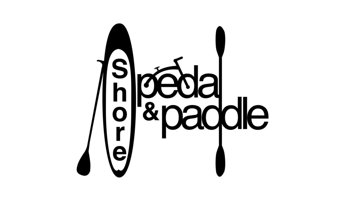
Creating the logo for St. Michael’s kayak, bike and paddleboard rental shop, Shore Pedal & Paddle, was almost as fun as getting to try all of the totally rad equipment this business offers. If you’re a local, you know that St. Michaels, MD is a charming waterfront town and SP&P’s ultimate mission was to provide tourists and year-round Marylanders with the opportunity to explore the Shore on land or water. When it came time to sit down and dream of a logo that “said it all,” we knew clean and clear lettering had to serve as the logo “glue.” Instead of playing up a Maryland-inspired color scheme within the logo itself, a simple single color design conveys the notion that SP&P is THE one-stop, utilitarian shop for renting FUN (as the owner would say!) We knew the logo would be used to create t-shirts, water bottles, vinyl stickers and more so we decided to use stylized silhouettes to tell the brand story and make the information clear and recognizable.
CLIENT : Shore Pedal & Paddle | David Geller
YEAR : 2013
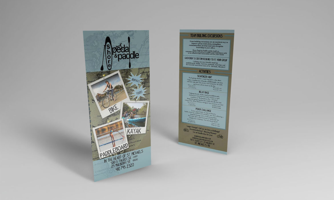
PROJECT : Logo | 4X9" Rack Card
Share :